About Me

My photo
GR, MI, United States
Above all else I must make a confession: I am a procrastinator. Whew, could not wait to get that out there. At the moment my name is Peter J. White. I am the son of Jim P. White and Ann M. White and the little brother to a Katie and older brother to a Ruth. Those are some of the people that are important to me. Over the past few years of my life I have changed more then ever before. Everyday is a new day; everyday is a new me. Not to say if you knew me in the heady days of high school you would not recognize my personality, or my appearance, but I would see you in a new light. Lastly I have learned a few things lately that I would like to share. Hard work is not cheap. Take nothing for granted. And, this one is for the world; if we work together we might make this whole damn thing (life, the universe, and everything) work. But mostly: enjoy. Much love, Peter J. White

Tuesday, October 28, 2008

Whale.

With this piece I was trying to figure something out to catch the eye. Then I remembered the most eye catching design in the history of design.: Polka Dots.
I wanted it to be something ridicules so I decided upon a whale, and that is how polka dot whale productions was started. It is happy go lucky, something that represents me pretty well. When I put the text in I found it created a lot of zero space. As a remedy to this problem, I opened up the tracking on the fonts below the name of the DVD. I tried to create a diagonal line with the different DVD options.

In the class critiques a lot of people said the title and the DVD menu options run together with the title. I had a lot of suggestions to space them out more but space is something of an issue so I will underling the title. I feel that would give it enough separation from the rest of the menu. Some people did not like the placement of the “play all” button, or the fonts I used for it. I am not sure what to do about that. I have experimented with placing it in the whale but I need to tool around with it some more.

When the menu options are selected I want them to light up, and for the play all, I would like the entire whale’s outline to light up.

Thursday, October 9, 2008

The Zed word

Zombies... they are not real...yet.

Our most recent assignment, other then this one (blog), has been to pick a opening credit sequence and analyze them. I have not gone yet, I am set up for October 16th to present. I decided for multiple reasons to do Shawn of the Dead's opening credits. I feel like they pay homage to the classic zombie movies, while still remaining fresh. If you have not seen them, check them out.

They are about three minutes in.

A thousand words in just a few.

I had a lot of fun making these sayings. Unlike my replication project I am rather proud of these, however I consider, to some extent, them to be a bit of a work in progress. The only problem, I am not sure what else I can do with these, so comments are appreciated.


War is possible the most complicated human interaction. Probably all technological, social, cultural advancements have steamed from its gritty reality. This is because war is so nasty it pushes people to excel. If they win, everything could be won but it they lose everything could be lost. Men like Julius Caesar understood that, he also knew what it took to win battles and wars: money, a disciplined army, and overwhelming force. Hence the pictures mirror these attributes of war. In order for the pictures to shine through clearly, required a little doctoring. I used a font called Hoefler text. To get the pictures to come through a little clearer I went in with the pen tool, and expanded the letters by combining the pen overlay with the text below it. But before that I manipulated each line separately, deciding to overlap them as much as possible. I wanted the entire piece to be a little confusing, but not unreadable, to mimic the "fog of war." To do this I stacked the saying the opposite way people's eyes are used to going, and basically overlapped every word.


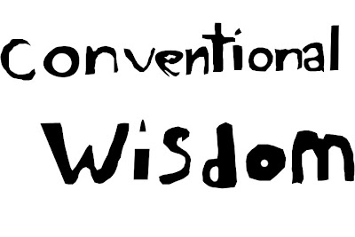
As long as I can remember I have been opposed to the concept of "conventional wisdom." Wisdom is anything but basic, or everyday, or common for that matter. I consider conventional wisdom to be somewhat of a crutch. Created by people's needs to fill in the gaps between their patches of knowledge. I my design to reflect that. Also I wanted to write with the pen tool. After working out each letter to my liking I would reasterize them. And once I had finished a whole word, I combined them onto a single layer so I could easily move the words to where I wanted them. I really like the dirty look they have, it reminds me of mold, or fungus growing out of the ground feeding on the general knowledge of a community.

The sleeping giant of our time is the growing AIDS epidemic in Africa. For the time being it is pretty much limited to the third world countries, but that could change. Regardless, there is a duty their to help fellow man.
Upon reading the phrase I thought almost instantly of America's foreign aid to such nations. It is not enough, and if we continue done our current heading before we know it there is not going to be anything we can do.
It is not the governments fault, it is the fault of the American people (people like myself frankly). To communicate that thought I decided to create a flag with the phrase. Originally I wanted to warp the text into the familiar flag wave, but it did not look right. So instead I decided to use a gradient overlay to create a contrast between different parts of the flag. This gives the flag a eerie feeling of movement.

Thoughts? Suggestions? Jokes?

Training #1


For our first assignment the task was deceivingly simple. We needed to find an ad online and using photo shop, our own photos, or drawings, we were to replicate the add. So naturally I set out to find a add that I felt I could replicate. Most of the ads I found were either too complicated or too intimidating. Eventually I stumbled upon the ad to our right here.

The first thing I need was a picture of a can, that looked decent. So I borrowed a Friends Camera, a Cannon rebel digital SLR, and snapped a few pictures of a can of peas (I took the label off). If i remember correctly I shoot them at a shutter rate of 800, but it has been a while, I should start writing these things down.

Once I had snapped a few pictures of the can with both their respected backgrounds I imported the pictures into photoshop.
My first step was to get the two pictures, that were in color, to back and white. I played around with the contrast and saturation until the two pictures mirrored the look of the ad. Further more, while I was taking the pictures I was sure to set the lighting up in such a way to make the can on the right pop out like in its big brother ad.

Once I had achieved a similar enough look, I then cropped both image down because they were full sized photos. Then I dropped them both onto a new page. Next to replicate the text I began by looking through all the texts that photo shop had to offer, it proved to be a red haring. At the time I did not even think of searching the internet for it, but because of this project I now know better.

This is where I begin to fall completely short of expectations. There is not a graphic in the corner of my ad, like the original, nor are their any hands/can openers in my version. And to be completely honest I would prefer that this project would just die and leave me alone, but like bad slasher films, it just keeps coming back to haunt me.

That being said, this project taught me a lot about the workings of photoshop and that experience benefited me in my next endeavor. Our next project we need to take a series of sayings and help them communicate their meanings using photoshop.

Wednesday, October 8, 2008

A little background

After twelve years on this planet I was introduced to my first video camera. Since then I have wanted to be involved with Film/Video in one way or another. As a student at Grand Valley State University I am studying the in's and out's of the Film and Video world. It has been a blast. Recently I have begun to dabble with Photoshop and to a lesser extent Adobe Illustrator. I still do not know what to do with these programs but I am getting better. This blog will showcase a few of my recent works. Any feed back is appreciated especially if you have any pointers.

Blog Archive

Followers